Jamie Cha
Computer Scientist | UX Designer
Asian Student Achievement (ASA) - Website Redesign
Case Study Overview
Asian Student Achievement (ASA) is a nonprofit 501(c)(3) organization whose mission is to help Asian and Asian-American
students move through the pipeline to leadership positions. Initially launched in 2016, ASA’s website never fully considered user experience during the design phase. Having gone through a recent rebranding, the ASA Web Design Team sought to improve on several things including making the site clean, informative, and easy to navigate.
Project Duration
April 2024 - January 2025
Tools
Team
- Jamie Cha (UX/Tech Coordinator) - Team Lead, UX Researcher
- Tyler Turner (Website Intern) - Web Designer, UX Researcher
- Sarah Mun (UX Intern) - UX Researcher, Writer
Goals
- Increase website traffic utilizing the feedback from user testing.
- Simplify website pathways.
- Implement UX design principles to the existing website, ensuring a smooth experience.
Research
Site Analysis
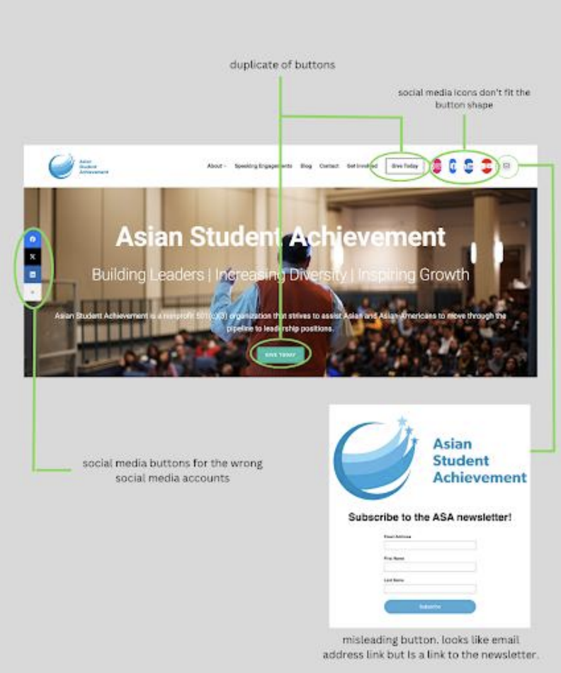
The initial goal of the website was to be informative and interactive. However, this resulted in a crowded interface that creates more confusion for users.
We highlighted the following issues to tackle the redesign:
- Crowded naviation bar.
- Improper social media links.
- Repetitive elements.
Competitive Analysis: Save the Waves
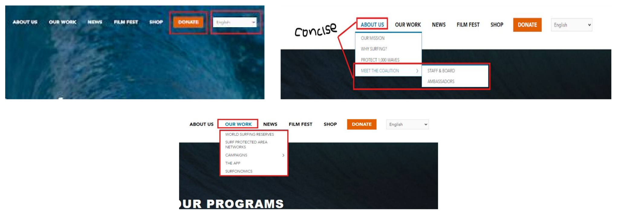
Save The Waves is an international nonprofit dedicated to protexting surf ecosystems by collaborating with grassroots organizations and managing projects to encourage coastal stewardship.
What they do well:
- "Donate" button is highlighted in a different color from the rest of the navigation bar elements to make it stand out.
- Translation feature that makes the site accessible to users who speak different languages.
- Clear and concise headers on the navigation bar.
Competitive Analysis: Pencils of Promise
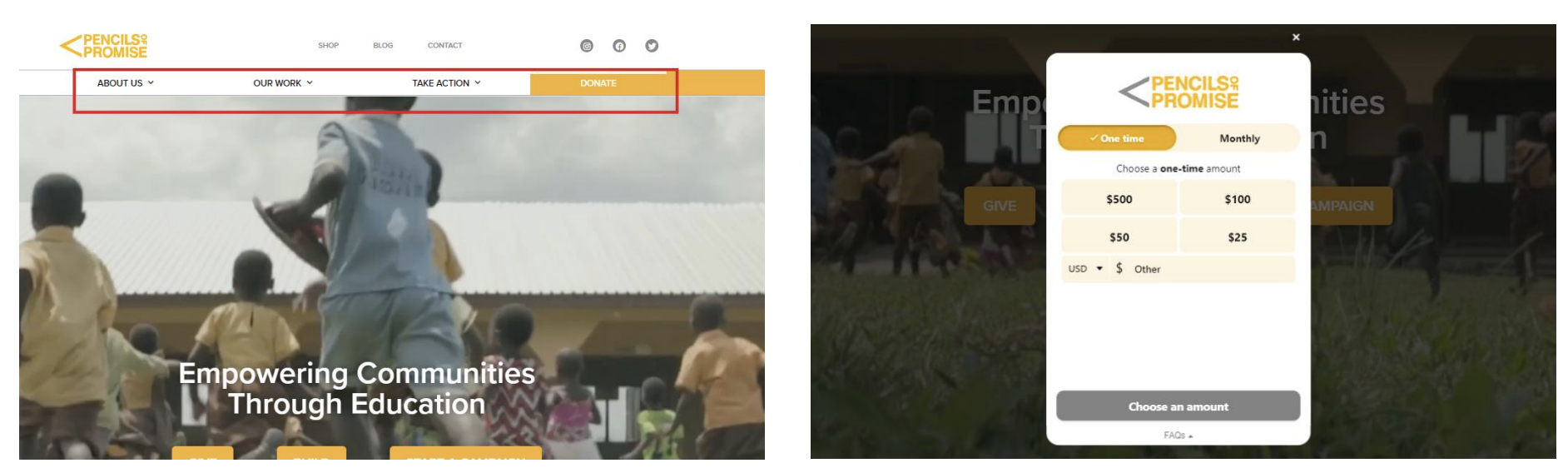
Penicls of Promise is a nonprofit that works to provide access to quality education by creating schools, programs, and global communities all around the world.
What they do well:
- Clear and concise navigation bar.
- Allow users to donate without having to navigate to an entirely different site/page.
User Testing
Interviews
We asked 9 users to walk through the website and complete certain tasks. This helped us users’ mental model of site navigation
and look for areas of improvement to ensure clearer pathways.
From our testing, we highlighted 3 key insights relating to navigation:
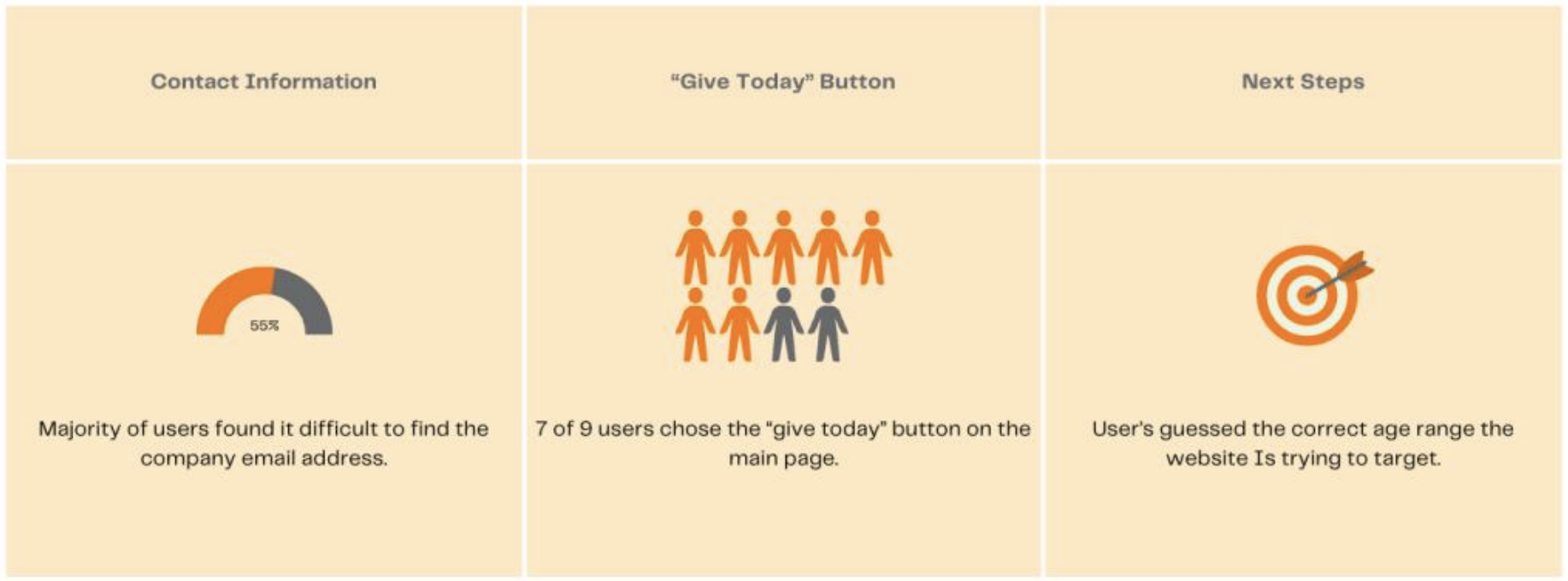
These findings reaffirmed our beliefs that ASA’s website suffers from navigational issues, especially relating to contact information and social media.
Personas
Meet John
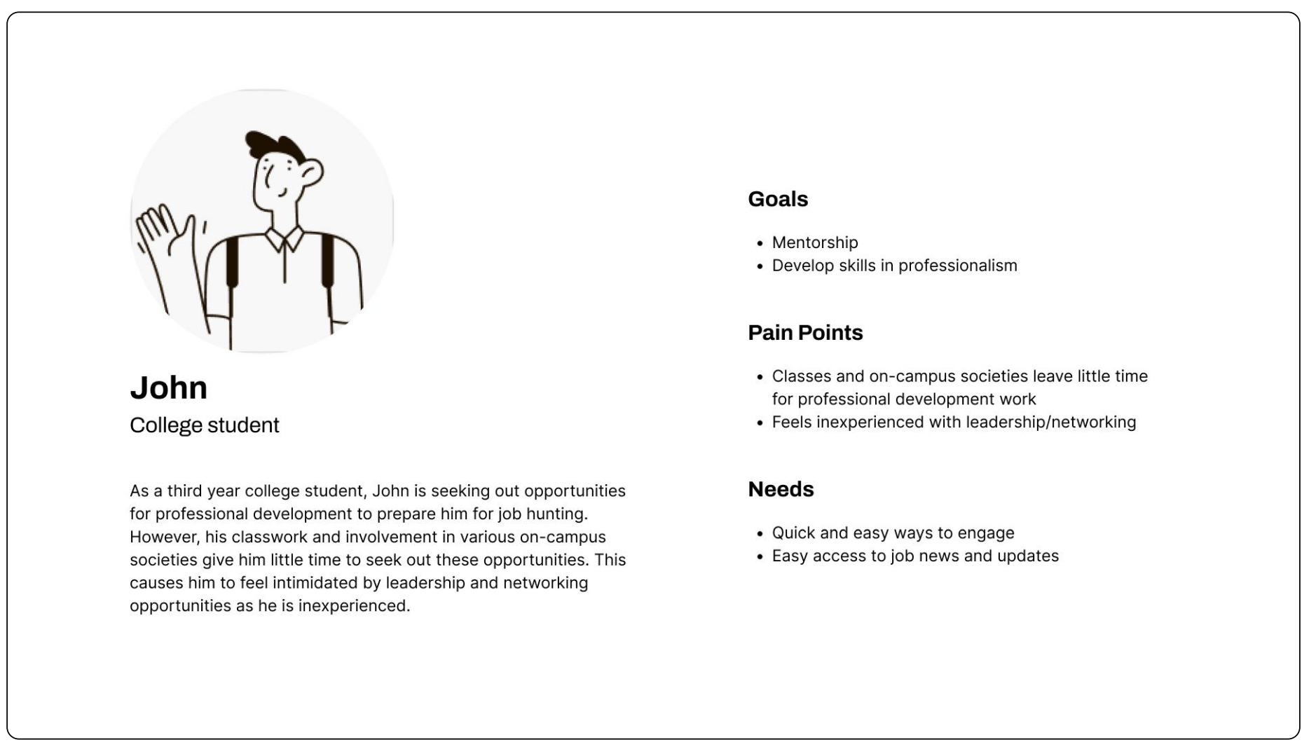
Our first persona is John, a third year college student who wants to improve his professional development skills to prepare for
future job hunting.
Meet Grace
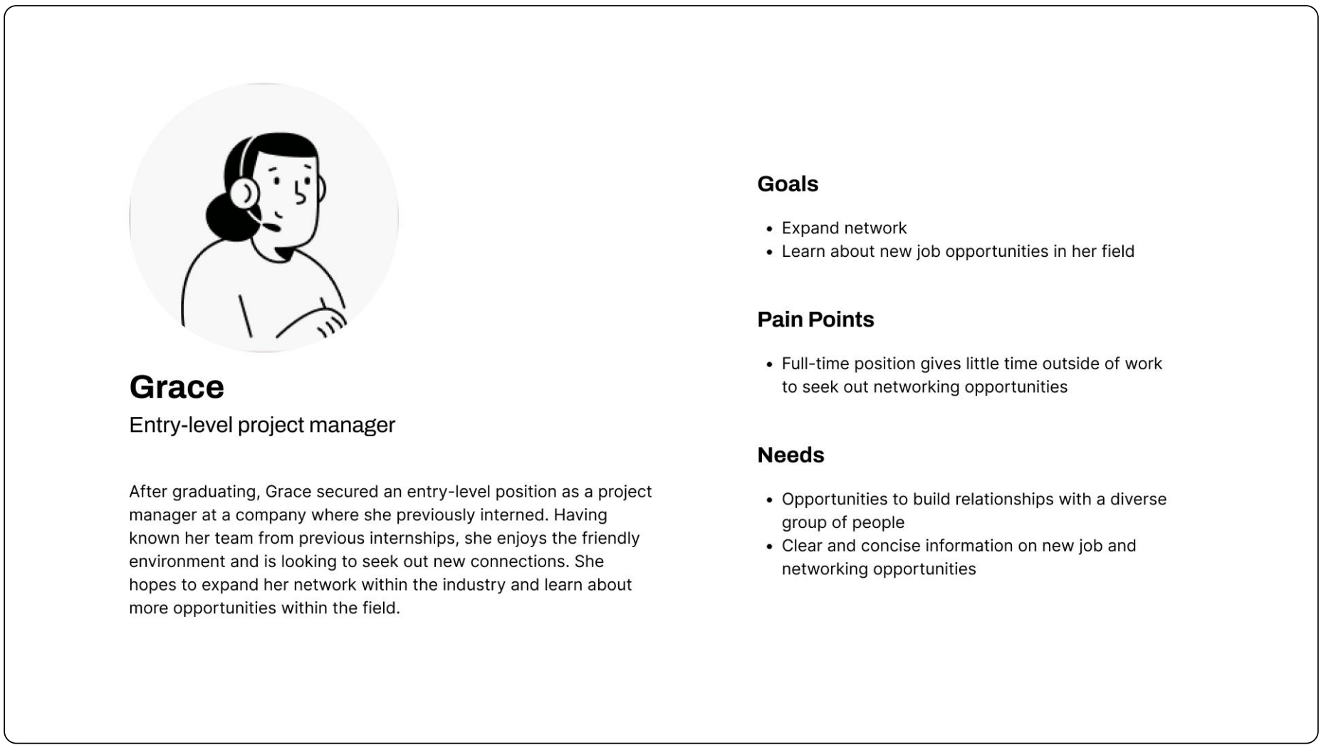
Our second persona is Grace, a young professional who wants to expand her network and learn from diverse perspectives within
her field.
Iteration
Sketching
Based on user feedback, we believed that redesigning the site’s
navbar and footer would help reduce clutter and align closer to our users’ mental model of the site. We chose to move ASA’s social media links and contact information to the footer to clear space in the navbar.
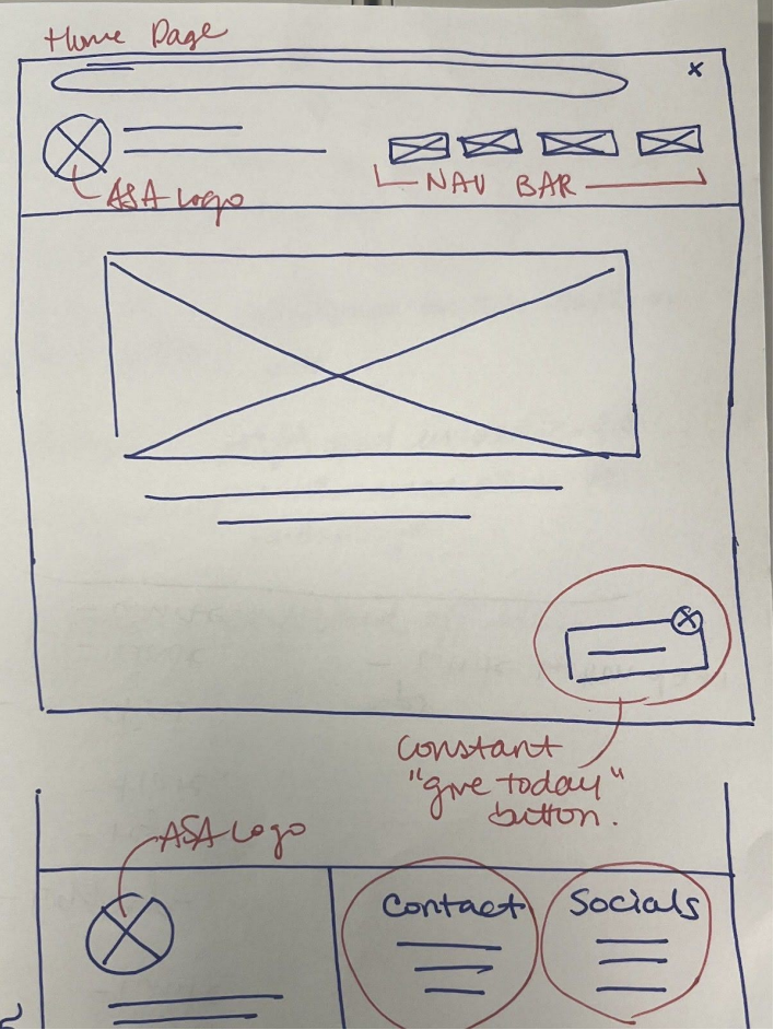
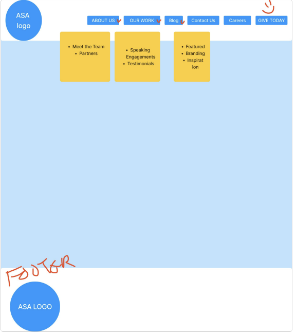
Wireframe
From this sketch, we created a low-fidelity wireframe which models what the new navigation bar would look like without ASA’s social media links.
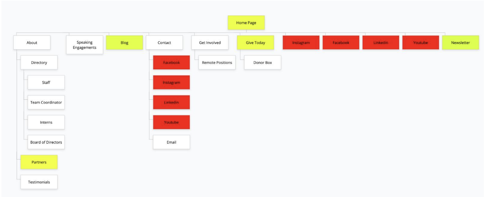
Sitemap
This sitemap outlines the website’s existing navigation. We designated repetitive elements/links in red, links with multiple access points in yellow, and links with only one access point in white. After consulting the design team, we chose to remove the
repetitive links to make navigation clearer.
Interface Design
Overview
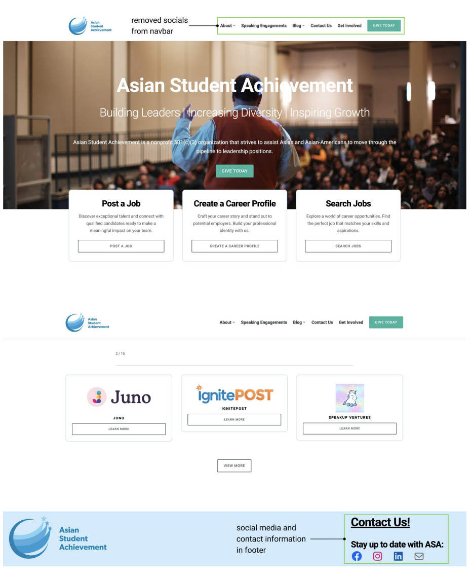
In the final design, we prioritized clearing up the navbar by moving socials to the footer.
This created a cleaner interface and matched our users’ mental model of finding contact information on the ASA site. We also took this opportunity to ensure that all icons were properly linked.
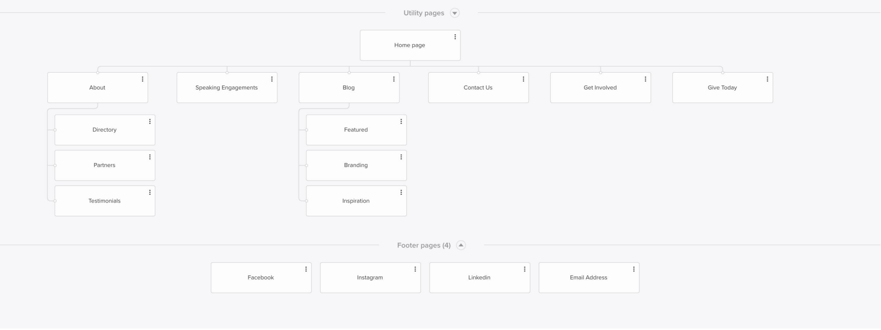
Sitemap
This sitemap reflects the changes made to the site’s information architecture. Moving all social media links to the site’s footer helped reduce clutter and repetition in the navbar. We also took this opportunity to add new links under our “Blog” page.
Conclusion
Results + Next Steps
From this project, we got to practice more UX techniques and experiment with tools such as sketching, wireframing, and design
softwares.
There are still changes that we would like to implement, including the following:
- Cleaning up various pages to increase clarity on the site.
- Creating formal styles to standardize colors and fonts on the site.
- Making the website accessible in multiple languages.
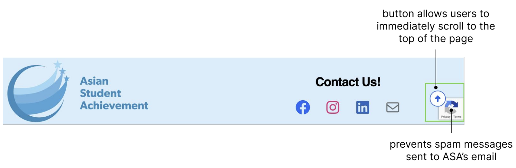
Update #1
Recaptcha + Scroll button
After reviewing ASA’s site analytics and email account, we found that ASA faced an issue with receiving spam emails. To prevent this, we implemented a Recaptcha system to the entire site. This will help monitor human activity from automated activity on the site and help ASA employees manage messages.
Since ASA presents a lot of information on its pages, we also added a scroll button on each page of the ASA site to help users easily get back to the top of the page. This button will help create a more efficient browsing experience by reducing the amount of effort users have to exert in order to get to the navbar on the top of each page.
Update #2
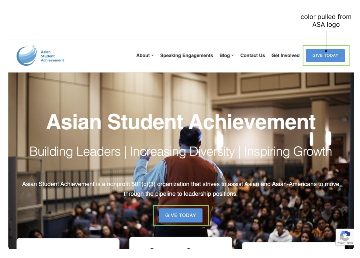
Button color change
The design team noticed that there were inconsistencies in color throughout the page. One way we tackled this issue was by changing all button colors
from green to blue. We made this choice based on ASA’s current logo and believed that this would help create more cohesion throughout the site.